Web accessibility is more important than ever, so make sure you’re not inadvertently discriminating against employees on their benefits microsite.
Why Pay Attention to Web Accessibility?
As we mentioned in a previous post, more benefits communications continue to happen online, it’s becoming critical for employers to pay attention to the latest Web Content Accessibility Guidelines (or WCAG) when building benefits microsites. This ensures that all employees have equal access to vital benefits information.
As the W3C states on their site, “Accessibility involves a wide range of disabilities, including visual, auditory, physical, speech, cognitive, language, learning, and neurological disabilities.” And the population of your clients’ employees who benefit from WCAG measures could be larger than you think, as there are people with varying degrees of impairments that use assisted devices to navigate the web.
Besides, as with other accommodations for people with disabilities, WCAG compliance improves the UX for everyone else. According to Usability.gov, “Case studies show that accessible websites have better search results, reduced maintenance costs, and increased audience reach, among other benefits.”
First, the Most Common Accessibility Mistakes
For the past 3 years, WebAIM has compiled the most common WCAG mistakes present on the homepages of the top 1 million websites. Those fall into six main categories.
- Low contrast text
- Missing alternative text for images
- Missing form input labels
- Empty links
- Missing document language
- Empty buttons
HR Web Accessibility Mistakes and How to Avoid Them
In addition to those more universal accessibility mistakes, here are some common accessibility mistakes we see on benefits microsites.
1. Bad Color Contrast
Yes, this one again. Since most of the content on microsites is text-based, this bears repeating. Even partially color-blind people need good contrast between text and backgrounds to read the content properly.
How do you Avoid bad Color Contrast?
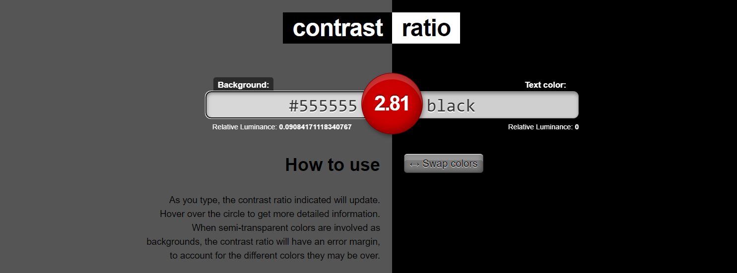
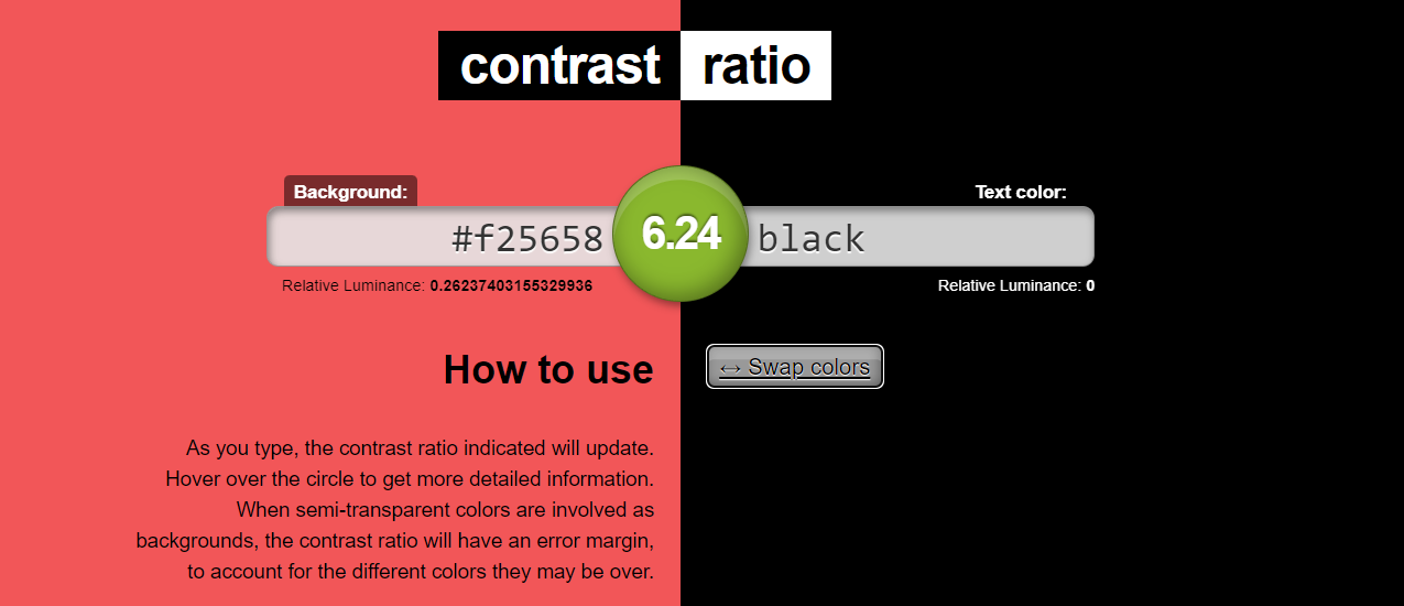
If your web designer doesn’t already have a visual impairment, it might be hard to tell what level of contrast is sufficient. That’s why we use contrast checkers like the one on WebAIM or contrast ratio.com. These tools let you paste pairs of hex codes to represent the text and its background, then give you a ratio with an evaluation of whether it passes WCAG compliance or not.


2. Unstructured Content
When employees use screen readers they need to be able to clearly detect headings, subheadings and bullet points, otherwise, they won’t be able to make sense of the content. But indicating the order of importance by size or color isn’t enough. According to Penn State’s Accessibility guides,
“Visual readers are able to identify headings by scanning pages for text of a larger size or a different color/font face. Blind users on a screen reader are not able to see these visual changes, so increasing the font size is not a sufficient cue. Instead, the headings must be semantically “tagged” so that a screen reader can both identify headings and provide a list as a page or document table of contents.”
How do You Properly Structure Content?
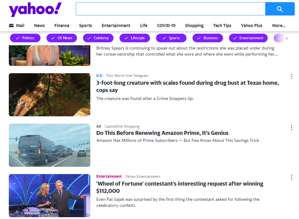
We recommend using the H1 tag for page titles only. Then use each successive heading tag in sequential order, i.e. H2 for major headings, H3 for major subheadings, H4 for minor subheadings, etc.
3. Vague Link Text
It’s important that text that links to a new page be clear to the reader and make sense without knowing the context around it. So avoid links that say simply “Read more” or “Click here” since they don’t tell the reader what will happen on the other side of the click.
How Do You Fix Vague Links?
Ideally, your designer could leave out those vague links altogether and use the titles of articles or files as the link themselves. Failing that, you could use short sentences that are easy to understand when read aloud. E.g. “Click here to read about medical plans”, and “Read more about our plan changes here.” If those end up being too long, then developers can add an “Aria-label” tag to vague links that give screen readers context for the link.


4. Ignored or Subtle Focus Styles
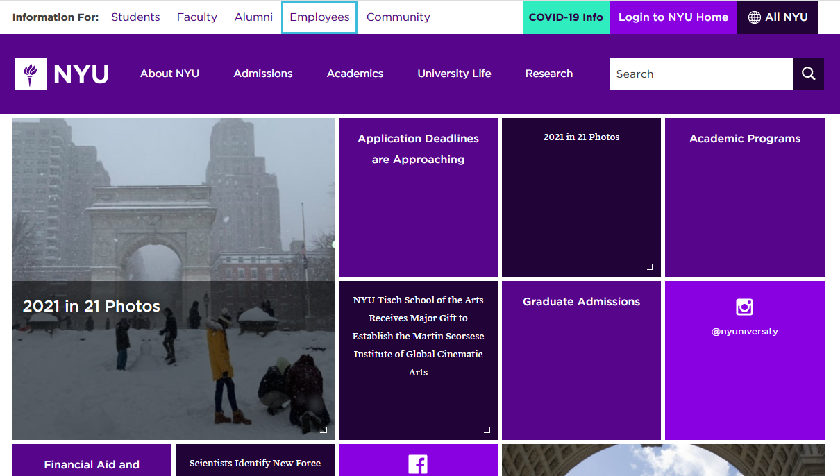
Focus styles tell the browser how to draw attention to any clickable elements that are currently selected. These are supposed to be obvious and obtrusive so there’s no confusion about what a reader is able to do, which tends to make clients want to downplay their appearance or remove them completely.
But according to Yale’s Accessibility guides,
“Keyboard-only users may not be able to use a mouse to click links. They use a keyboard’s tab button to navigate through a page’s links, buttons, and form inputs. For such users, it is very important for them to see which item has focus at all times.”

Of course, it’s always better to have these in place before building the site, but it’s never too late to implement good WCAG compliance. Ask your web developer or development vendor to run an evaluation looking out for the color contrast, use of header tags, link text, and focus styles.


