
Here’s how to decide when to use in-page tabs or accordions to shorten those lengthy benefits pages.
What’s the Problem?
When planning content for a benefits microsite, HR communicators invariably have to contend with lengthy pages filled with important, but sometimes overwhelming benefits information. Knowing how little people read online, this understandably leads to the desire to shorten the pages in the hopes that employees will find engaging with the details of their plans less daunting. Putting aside the fact that we now know that readers on the web are willing to scroll and read long pages if the content is relevant and readable, we can sympathize with the instinct to want to make benefits content more usable by shortening pages when possible.
When discussing this predicament with our HR partners we typically recommend breaking up the content and spreading them over multiple pages. But when this isn’t doable we’re commonly asked about two in-page UI features, tabs, and accordions. Even though they solve the same problem they have different strengths. So think about the type of content you want to condense before choosing which one to use.

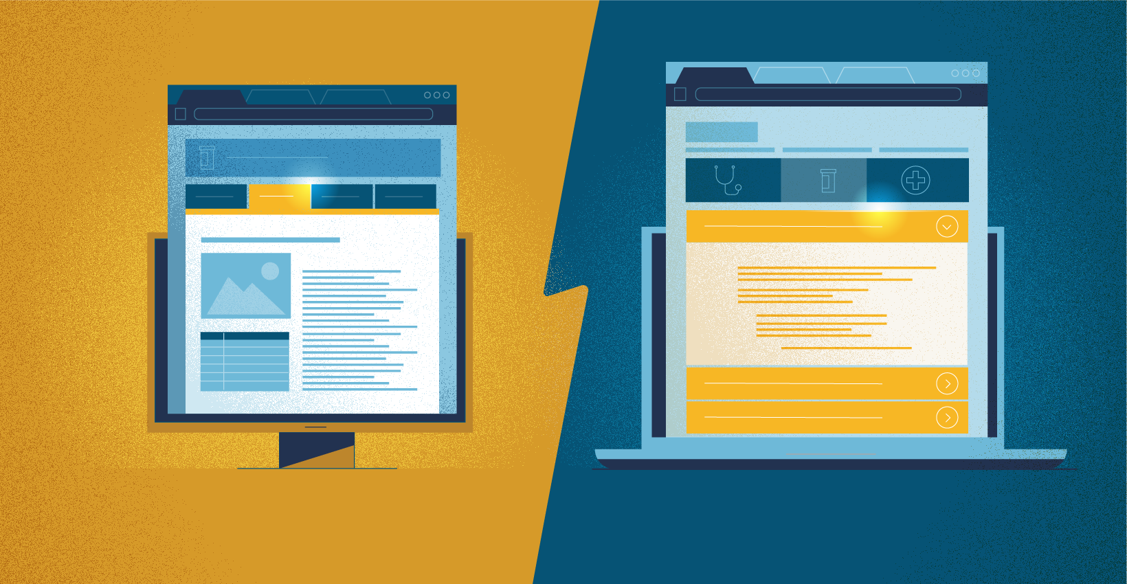
What are Tabs? (In-Page Tabs or Module Tabs)
Just like real file tabs, in-page tabs are meant to serve as a quick navigation tool to jump between chunks of related content, each housed in a different pane where they’re only visible one at a time. As Jacob Gube of Smashing Magazine puts it,
“The primary goal of the module tabs UI pattern is to permit users to view a group of related data one at a time, which in turn allows designers to modularize this group of information in a compacted manner, saving valuable screen real estate.”
When are In-Page Tabs Best Used?
1. When the Information Being Condensed is Related
As Grube writes,
“Information in the panes of module tabs must have some connection to each other so that users can make a logical correlation towards the content of the component.”
For example, tabs would be appropriate when displaying different aspects of a particular benefit plan, say the medical, dental, and wellness components.
2. When Employees Only Need to See the Information in a Single Tab at Any One Time.
If employees need to, say, compare information housed in different tabs the constant clicking between tabs will get annoying really quickly. According to Rebeka Costa, SEO Manager of the design tool Justinmind,
“…in-page tabs only make sense if the user doesn’t need to see content from multiple tabs simultaneously.”

3. When the Tab Labels Can Fit on One Row and Can be Condensed to 1 or 3 Words
This might seem like a trivial detail, but in order for the tabs to be useful, they need to be easily scanned by the reader. Creating sentence-long labels, or wrapping them onto multiple rows, will cause unnecessary friction in the employee’s minds as they try to figure out how to use the tabs. So if you know there’s a chance the number of sections will grow significantly;y, then tabs aren’t the best option. Also, if the headings for each section of content need to be worded as sentences or questions, then that’s a good sign that you might need to use our next UI device.

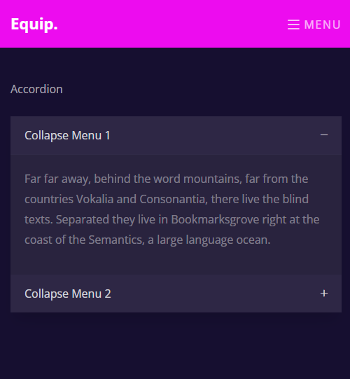
What are Accordions?
Accordions, or expansion panels, solve the content overload problem by vertically stacking a list of headings each with its own related content hidden from view. When an employee clicks on a heading, the rest of the list slides down and makes room to display that section’s content. As Hoa Loranger of UX research firm Norman Nielsen Group writes,
“It is one of many ways you can expose content to users in a progressive manner. Allowing people to have control over the content by expanding it or deferring it for later lets them decide what to read and what to ignore.”
Usability Issues with Accordions
Even though accordions are a popular space-saving device, they come with some inherent usability issues:
Too Many Clicks
In an effort to make the page more usable by shortening the page, accordions add the inconvenience of having to click several times to see all the content.
Out of Sight out of Mind
As Loranger writes, “Hiding content behind navigation diminishes people’s awareness of it. An extra step is required to see the information. Headings and titles must be descriptive and enticing enough to motivate people to “spend” clicks on them.”
Not Printer-ready
If an employee needs to print out an entire page, accordions force them to print it out in segments as typically they aren’t well suited for printing.
When are Accordions Best Used?
1. When Employees Only Need to Read the Content a Chunk at a Time
If the content can be broken down into bits that don’t rely on each other then navigating the content an accordion at a time is a seamless experience. This is why expansion panels are a great tool for FAQ pages or walking a reader through a form. As Tess Gadd writes for UX Collective,
“Forms often use accordions because they are really good with progressive disclosure. The user will only have to focus on one section at a time.”
2. When Space is Limited
Even though readers are willing to scroll on a desktop or tablet, that’s not the case on smaller screens. In those cases, the ability to quickly scan the content headings through an accordion gives readers a sense of the relevance of the page and makes for a better experience.
Conclusion
Both tabs and accordions are great for reducing the cognitive strain involved in reading long pages. Tabs are more suited for grouping related sets of information, as long as readers don’t need to look at more than one tab at a time and the tabs can fit on one row. Accordions can come in handy when employees only need to read a bit of the information at a time and on small devices. But beware of the usability issues of requiring users to click a lot and wrestle with printing out multiple pages.


