

Here are the 13 most important metrics to track on HR microsites, and what they mean.
Why are Analytics so Important?
After putting all that time and effort into building a benefits microsite, analytics helps HR teams see how well those efforts are being received. They provide a gauge for what content is most useful to employees, and which is getting ignored, helping HR continually improve the microsite’s employee experience. But since analytics tools tend to be built for people familiar with statistics, mathematical sampling and other technical knowledge, interpreting the data for your clients can be difficult.
Why are Analytics so Hard to Use?
We’ve already written on how Google Analytics’ incomprehensibility made us create our own custom dashboard for our HR partners. But aside from that, it’s surprising to the uninitiated that those fancy numbers aren’t as precise as we might think. There’s a fair amount of statistical sampling, rounding up or down involved, not to mention relying on visitors to opt-in to begin with. That, and the fact that Google gives you access to a mountain of data that isn’t relevant in an HR context, makes interpreting this kind of information a challenge.
But even though analytics don’t give you a precise picture of every single visitor, it’s still providing a useful sense of usage trends over time. If you know what to look for.
The Most Useful HR Microsite Metrics
Based on years of experience working with HR partners. This is the data that provides the most useful insights. Feel free to bookmark and use this as a reference next time you need to present metrics to your client.
1. Opt-in Rate
This tells you how many people are opting into being tracked while on the site vs. those that are opting out. This gives you a sense of how precise your tracking numbers are going to be. A high opt-in rate means you can be pretty confident that the numbers you’re seeing throughout the rest of the dashboard are representative of the behavior of a typical visitor to the microsite.
With our sites, we record opt-in and opt-out of various cookie settings. If you aren’t tracking opt-in or out, we encourage you to add this feature to your site.
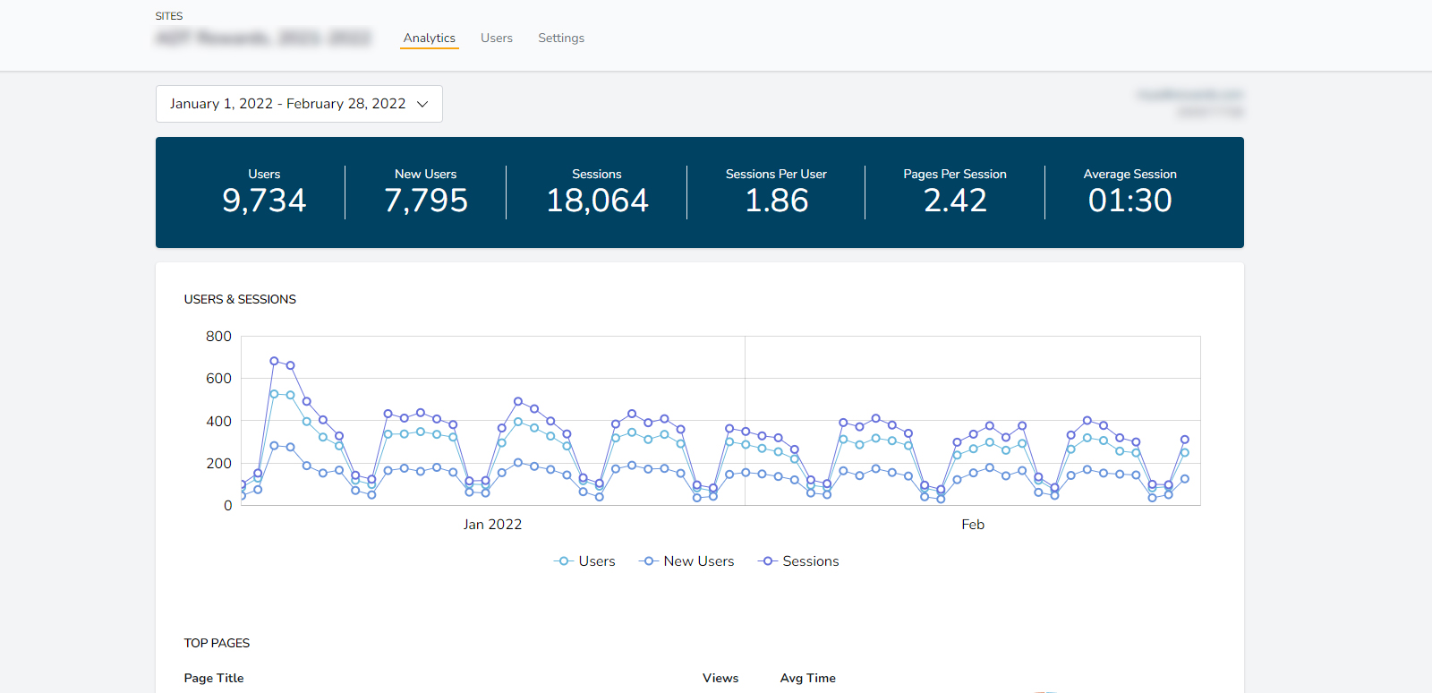
2. Users
Since each device is registered as a user by Google Analytics, this number represents all unique devices (not people) that have visited the microsite in a given time frame. Either way, a high user count is still a good indicator that your microsite’s content is doing what it’s supposed to do. Plus, a trend graph of users over time can tell you what time of day/week/month/year employees are most likely looking for relevant or new content.
3. New Users
This represents the number of devices that visited the site for the first time within a given timeframe. This is one area where the fuzziness of Google Analytics’ math might rear its head as it’s possible for the “new users” and “users” to be different even in situations where they should be the same, like when the time frame is starting from the beginning of the life of the microsite.
That being said, this metric can be useful if you set the timeframe to span the life of a special internal marketing campaign. This way you see if there’s an uptick in new users during the campaign compared to other time periods.
4. Sessions
Thankfully this is a self-explanatory term that refers to the number of times the site has been visited by a device. A high session count, of course, indicates plenty of visits which also means fewer calls to HR.
5. Sessions/User
This is meant to be the average number of times the site has been visited per device. It should be a simple ratio based on the number of users and the number of sessions, but rounding errors are possible here as well, so don’t freak out if the math doesn’t work out exactly. Just remember that this key metric indicates how useful employees find the content on the microsite as it’s a reflection of how often they come back to use the site as a reference.
6. Pages/Session
A ratio of the average number of pages any device visits each time it comes to the site. It’s understandable to want this to be a high number but it’s not necessarily a bad thing if the number is low. If the navigation on the microsite is intuitive and well laid out, it’s possible employees are finding what they want without needing to click around.
7. Average Session Time
As the name suggests, this is the average length of time each visit to the microsite lasted. The average time spent on a website is already fairly low, so don’t be surprised if this can be measured in seconds not minutes. But considering the content employees are looking for is benefits details, it’s not uncommon to see average session times in the 1 minute 28 seconds range. This is another metric where low scores aren’t necessarily bad, as it could indicate employees are getting the information they need quickly before leaving. It’s important to interpret this result along with other metrics like Top pages, Search terms, and On-page Events to get a better picture of your content’s effectiveness.
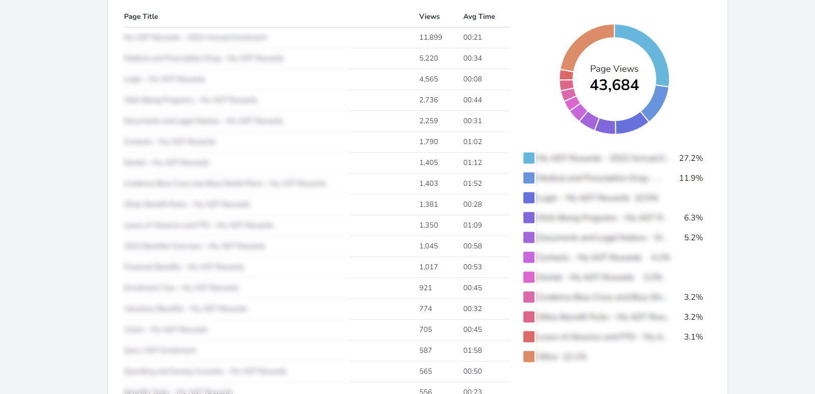
8. Top Pages
This is typically a list, and a pie chart, showing the most visited pages ranked in descending order of page views. Knowing the average time visitors spend on each of the top pages can be crucial to understanding users’ behavior so our dashboard includes this stat alongside the page view count. In addition to telling you what the most popular pages are, this list indicates which content is getting overlooked or isn’t working well.
9. Search Terms
Displaying the most popular search terms as a list and a word cloud gives you a sense of what content is the most popular in a given timeframe. It can help generate ideas for new content if there are keywords people are searching for that don’t have any content associated with them. It can also inform improvement to the navigation, as sometimes the prevalence of a search term means employees don’t readily see that term in the navigation.
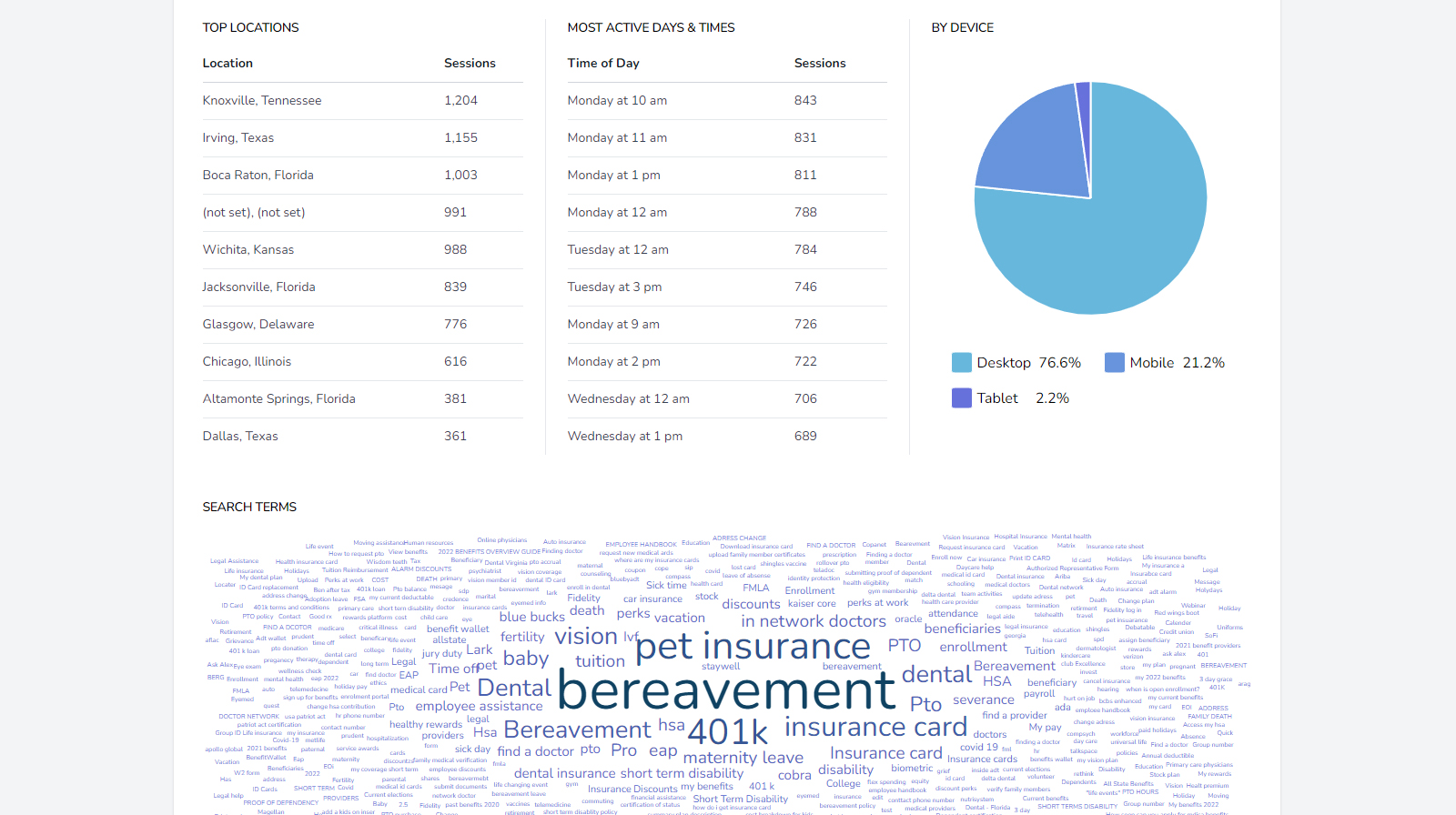
10. Top Locations
Information on top locations can be useful when you have multiple office locations in multiple regions. You can get a sense of how each area is participating and, if necessary, adjust or add communication efforts in areas where there is low activity.
11. Most Active Days and Times
This is incredibly useful when it comes time to launch new content, or even perform routine maintenance that might take the microsite offline for a few minutes.
12. Usage by Device
While HR microsites should be optimized for all devices, this metric tells you what proportion of the traffic is coming from each kind of device. Keeping track of device-specific traffic over time reveals useful trends, e.g. are employees increasingly visiting microsites on their desktops or mobile devices? Are workers more likely to see new content on a desktop or tablet?
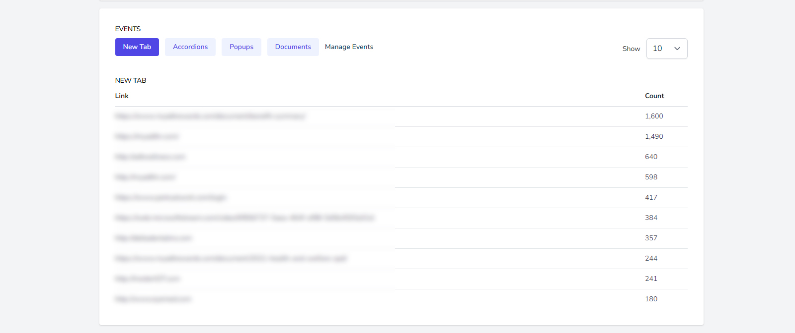
13. On-Page Events
It’s one thing to know how often employees visit a certain page. But to get really granular insight into how engaged visitors are, it helps to know what they’re doing on the page itself. That’s where tracking on-page events like accordions, new tabs, documents, and popups come in handy.
So, Keep in Mind:
With analytics on HR microsites, don’t expect precision. Rather, look at all of these metrics, in concert, as a way of sensing larger trends over time. Plus the longer you track your user behavior the more accurate the data, allowing you to make more confident content decisions.


