

Here are 3 questions to determine how many HR microsite menu links work best in any given situation.
Why is it Important to get the Menu Right?
The linchpin of a good microsite structure is the main navigation, so even though it seems like a small detail, the number of items in the main menu could have a tremendous effect on how well employees make use of the benefits microsite. Making important benefits content easy to find means employees are more likely to use the microsite as a regular resource rather than bombarding HR with calls and emails, especially around open enrollment.
Intuitively, we know that 10 or so links in the main menu feel like too many. There’s a reason people make fun of the Cheesecake Factory’s comically long menu rather than celebrate it. The overwhelming array of options greets diners with an unnerving sense of choice paralysis.
This, along with the well-known limitations of our working memory, leads website creators to lean towards the “less is more” model when deciding on a navigation structure. But giving employees too few options could also be detrimental as it would force visitors to hunt through levels of hierarchy to find what they’re looking for.
So what’s the right amount? Well, there’s no magical “right” number, so don’t aim for a certain amount. Instead, ask yourself these three questions.
1. What is the Scope of the Content?
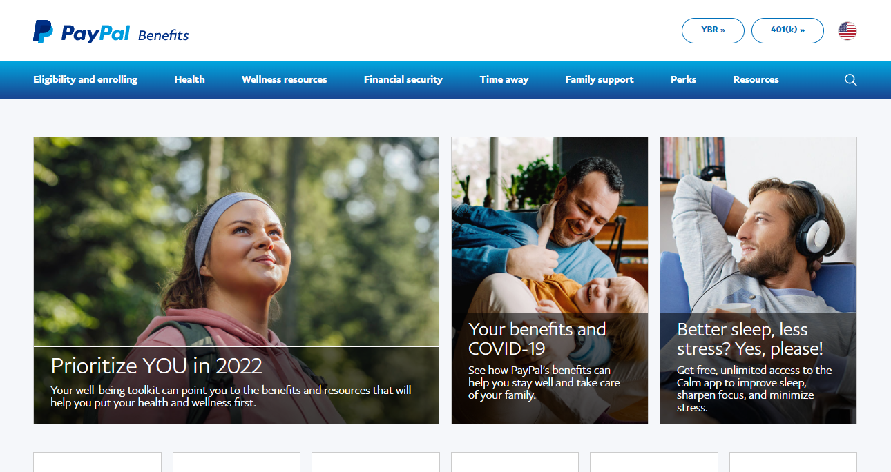
A microsite focussed on a narrow topic, say a specific wellness program, would be expected to have fewer navigation links than one covering the entire spectrum of benefits the company offers. In the latter scenario, a menu with up to 8 or 9 links, like that shown on Paypal’s benefits microsite, wouldn’t seem out of place.
2. How Clear are the Labels?
As Page Laubheimer, Senior UX consultant at Nielsen Norman Group, states in their video on the subject, “a lot of clearly understood labels is more useful than trying to artificially shrink the nav items for sake of brevity.”
For example, jetblue’s benefits microsite uses the label “Balance” to house a range of benefits like mental health support, leaves of absence, and substance abuse.
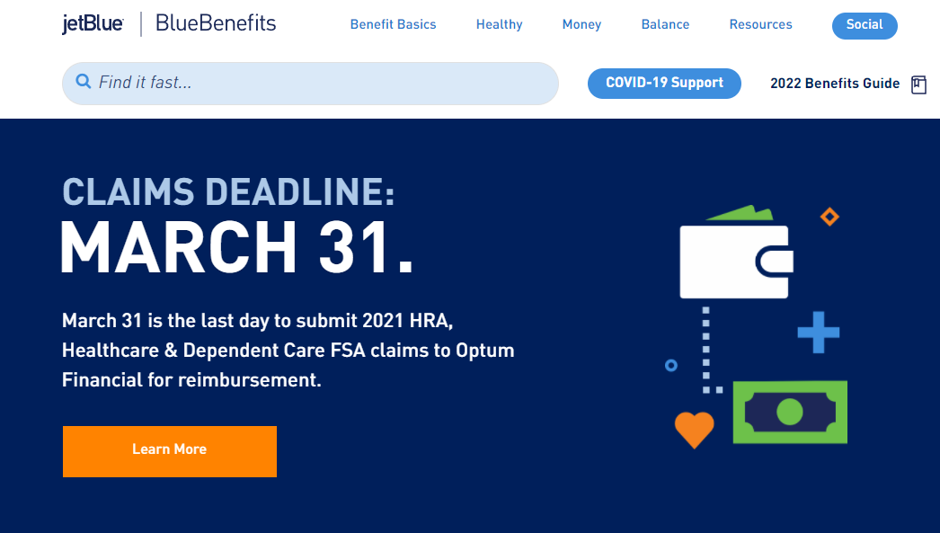
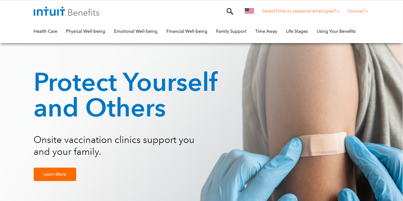
Even though it helps to keep the menu uncluttered, using a single vague word like ‘balance’ inserts unnecessary friction into the user experience. It would probably be better to use a wordier, but more clearly understood label as Intuit Benefits did with their use of the term “Emotional Well-being” as shown below.
3. How Many Levels Are There?
If trying to consolidate the top menu means the microsite ends up with three or more levels of subcategories, extra care needs to be taken with the sub-navigation to make sure visitors don’t get lost or spend unnecessary time clicking around. It’s better to have a shallow site with many clearly labeled top menu items than a narrow top menu that requires unnecessary clicking to get to important information.
Conclusion
It might seem like a small concern but the size of the main menu can make or break the success of an HR microsite. There isn’t a magic formula that can determine the right amount of links. Just pay attention to the demands of the content on the site, and ensure that the labels are clear and important information is easy to get to.


