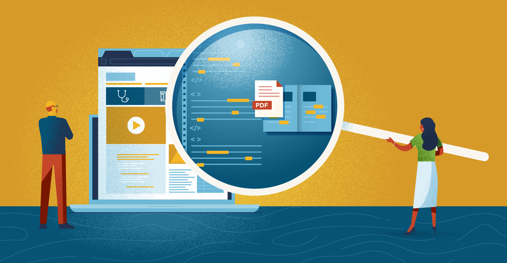

A benefits microsite is more than just an online version of a printed brochure. It involves careful consideration of what employees need to see based on where they’re at in the employee lifecycle.
HR benefits microsites are powerful tools that can help your business attract and retain top talent. They allow you to highlight your benefits in an engaging way and make them more accessible to employees, increasing employee satisfaction with their benefits and reducing turnover in the process. With all the different elements of your HR benefits microsite, it can be tough to decide what goes where and how best to arrange your site’s content so you don’t lose readers or overwhelm them with information they don’t need.
But don’t expect to simply copy and paste all the text from the print brochure onto HTML pages. Likewise, it’s possible to get overwhelmed with all the cool bells and whistles possible with modern web pages. But remember, interactivity doesn’t guarantee good usability. So having a plan is crucial if you’d like to avoid doing unnecessary work creating content no one is interested in while ensuring that the microsite covers all the content needs of your audience. The end result of this step should be a clear idea about what content and functionality the microsite needs.
1. Outline Content Needs
Figuring out what information is important involves understanding the state of mind of your audience. Don’t think solely of demographics like age or gender. Instead, think about what stage of the employee experience they’re in. So New Hires would have a different set of priorities than a long-time worker getting married or having their first child. And of course, there’s always the special circumstance of Open Enrollment where the main priority for all employees is what’s changed since last year.
If you’re ever stuck for ideas on what your employees need, below we’ve outlined the most useful types of content aligned with three major stages of the employee experience.
New Hires
- Benefits Overview
During the onboarding process, new employees aren’t as concerned with deductibles and in-network differences as they are with the range and scope of all the benefits they’ll have access to. - New hire checklist
There are probably a lot of different systems and processes to learn in addition to enrolling in a variety of plans. Having a checklist they can refer to helps them navigate the various options confidently and feel like they’re not missing out on something important. - Definitions
This is especially crucial for workers for whom this is their first job with benefits. Knowing the difference between a copay and deductible isn’t something being taught in colleges, so having definitions for common benefits terms will be helpful. - Where to Enroll in Plans
Typically enrollment in the various plans happens on separate platforms, but expecting employees to keep track of each site is unrealistic. A Benefits microsite can serve as the hub from which employees can access all the other plan providers’ portals.
Qualifying Life Events (QLE)
- Plan details
When life changes happen, established employees are going to want to know what options are available, and what to expect as far as coverage limits and costs. Employees are more motivated in this stage so they’re more likely going to use the search bar to get directly to the information they want. Succinct bullet points, graphs, charts, or tables will make this content more skimmable, hence more useful for them in this state of mind. - Providers
Knowing if their new doctor is in or out of network, or if the specialist they’re trying to see is covered. Knowing who to contact if there’s an issue with a certain service.
Annual Enrollment
- Benefits changes (“What’s new?”)
Every year there are bound to be new plans and new coverage limits. Temporarily carving out a prominent place to highlight these changes on the microsite helps established employees with their decision process and makes the entire open enrollment season go more smoothly. - Where to Enroll or make changes
Just like new hires, when it comes time to make those plan changes it’s great to have a central place where employees know they can go to access each provider’s portal.
2. Identify Functionality Needs
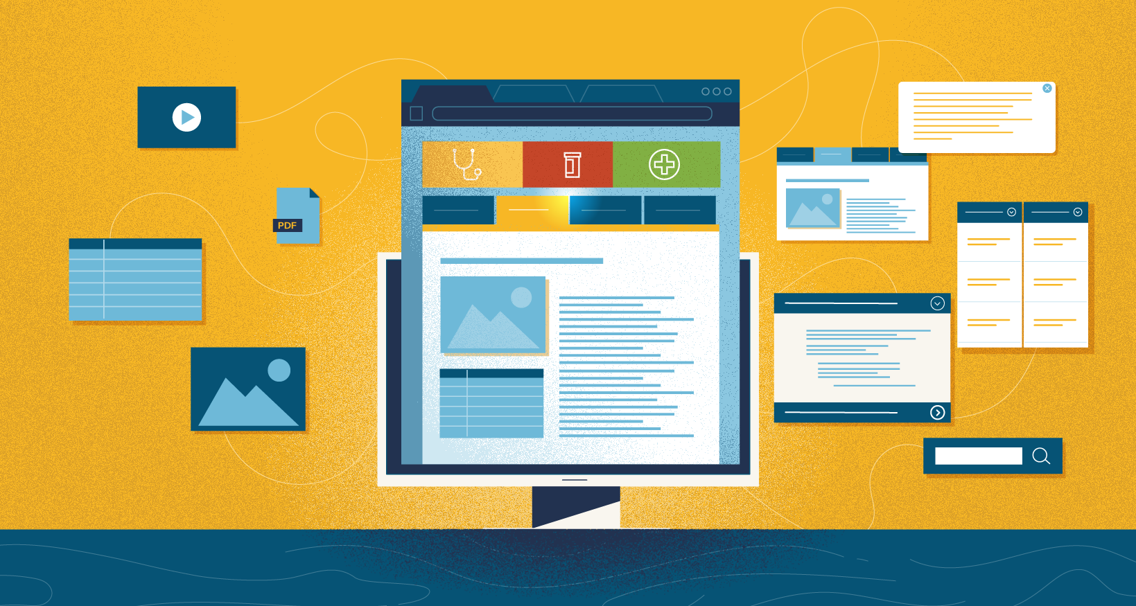
Just putting the content on the site in the form of endless paragraphs and pdfs isn’t enough. All that important information is useless if the way it’s presented on the site is hard to access or understand. One of the advantages of housing benefits information online, as well as in a printed piece, is that you have a variety of web-based features to help employees navigate the dense benefits information in a way that suits them.
Below is a list of the most useful bits of functionality for HR microsites along with where they’re best used.
Search Tool
Thanks to the ubiquity of consumer-grade search engines, this is the most used, and familiar, feature on a microsite. It’s most useful to return employees, outside of the open enrollment period who are looking for a specific plan or provider and need to find it quickly. As a lot of content on benefits microsites are still housed in downloadable pdfs its’ best to deploy a search solution that indexes pdf text along with HTML text.
Accordions
Accordions, or expansion panels, solve the problem of content overload by vertically stacking a list of headings each with its own related content hidden from view. When an employee clicks on a heading, the rest of the list slides down and makes room to display that section’s content. Accordions are best used when the multiple sections being hidden aren’t long enough to go on their own page, and employees don’t need to read all of the content at the same time. If the reader needs to know what’s coming next or keep in mind what went before, then making them click open and close several accordions could make the experience frustrating. So FAQs, or those text-heavy medical plan detail pages are a great use of accordions.
Clients used to be concerned about using accordions out of fear that the content hidden from view would also be undiscoverable by the site’s search engine. With more sophisticated search solutions like our Hound Search tool, that’s no longer an issue.
Module Tabs
Module tabs, or in-page tabs, are meant to serve as a quick navigation tool to jump between chunks of related content, each housed in a different pane where they’re only visible one at a time. As Jacob Gube of Smashing Magazine puts it, “The primary goal of the module tabs UI pattern is to permit users to view a group of related data one at a time, which in turn allows designers to modularize this group of information in a compacted manner, saving valuable screen real estate.”
Just like accordions, tabs are best used when the content they’re partitioning is related, and when the employee only needs to read a single tab’s content at any one time. However, since the interaction is based on selecting a horizontal row of headings, they’re not as useful for condensing long segments of information as accordions. So, this feature works best with a small number of sections to the tab labels can all fit on one line. And since moving from one tab’s content to another involves accessing the tab labels, these are also best used when the employee doesn’t have to scroll too far.

Check out our blog post on how to decide which feature (Tabs or Accordions) is best for certain situations.
Pop-Ups
These are good for short bits of helpful information with minimal disruption of the browsing experience. Unlike their annoying cousins, pop-up ads, are triggered by the employee so they are more welcomed especially when used to provide definitions of terms, contact details, or checklists.
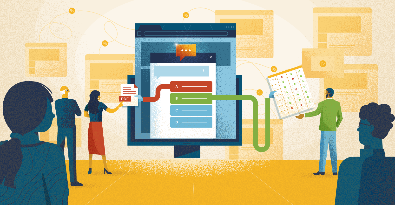
Chat UI
This is essentially a decision tree that quickly guides users to the benefits content they need. Wrapping it in a chat-like interface makes using it feel more fluid and intuitive than traditional navigation or search tools. In our version of this kind of tool, we use conversational questions based on key life events, not industry jargon. So visitors are greeted with a friendly “How can I help?” and options like “Baby care” or “Parent support” etc. Then each stage of the filtering process is treated as a casual Q&A chat between the visitor and the content, leading them to the relevant page. If the employee doesn’t find what they need, they’re greeted with a simple sentiment survey. This lets you know what content is missing from the microsite, helping you improve the experience of using the microsite over time.
Even though this works like a navigation tool, this chat interface doesn’t replace search or menu-based navigation. It supports them, sitting unobtrusively at the bottom of the page ready to help when needed.
Check out our blog post on the benefits of a Chat UI for navigation.
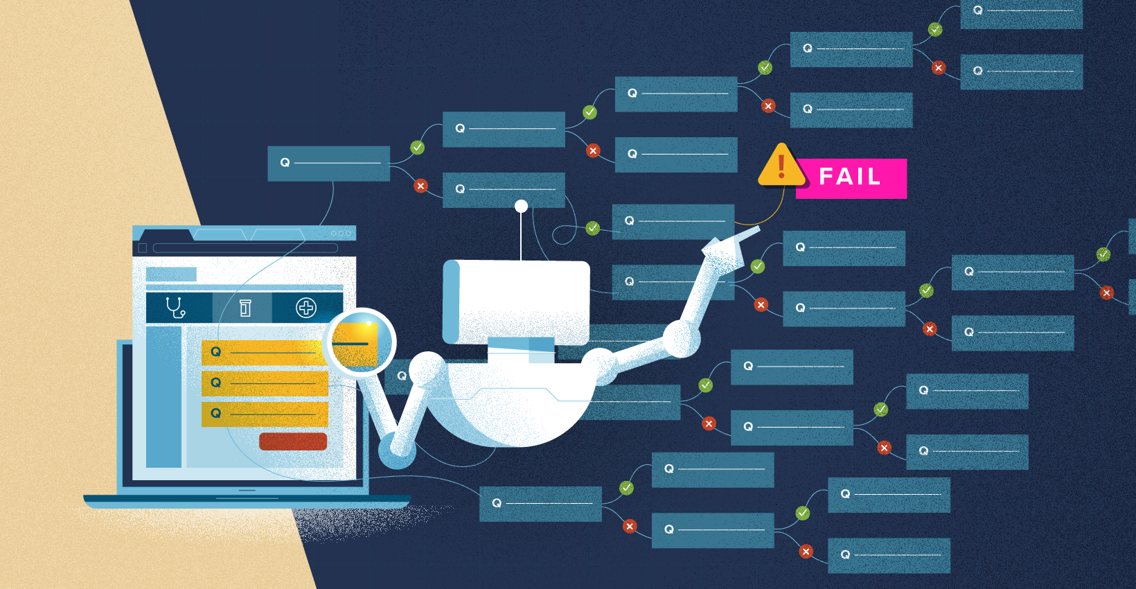
Decision Support Quizzes
As the name suggests these are short quizzes that ask employees pertinent health, finance, and lifestyle questions in order to offer relevant plan suggestions based on their answers. The goal is to help employees sift through the mountain of benefits information to arrive at a decision they feel confident best fits their needs. These can be deployed by themself or as part of the benefits microsite where employees can get more details on the plans being suggested to them. Either way, the end result is to lead employees to take action and enroll.
You can read more about why decision support quizzes are so powerful in our blog post here.
For more on how to get the most out of a decision support quiz, check out our blog post here.
Interactive Comparison Tables
One of the most time-consuming activities employees have to contend with each year is comparing the intricacies of all their plan options. These are typically displayed as a table with details like deductibles and copays lined up in a row for ease of comparison. This works well if there are only two or three plans to contend with, but each additional option makes comparing the plans increasingly harder. Interactive comparison tables allow employees to select which two or three plans they want to compare side by side. So even if there are 8 options, the employee only has to worry about comparing two or three at a time. Removing the unnecessary data allows them to focus on the important elements, making it easier to figure out which is their best choice.


