
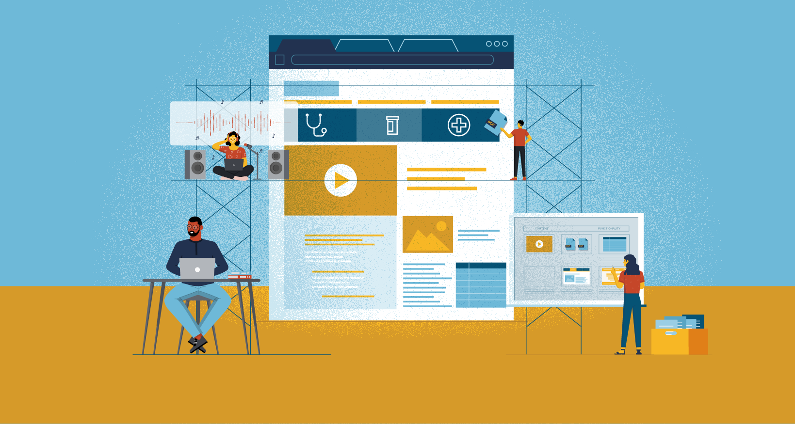
Even if you’re not a web development expert, you should still be familiar with these 6 essential steps to building an effective microsite for HR.
Like any web project, the first step to creating an effective HR microsite is planning. Check out our previous post for a look at what the planning process should look like. With that done, the next step is the building process. Whether you have access to an in-house web design and development team or are working with a third-party web development firm, the process should look something like this.
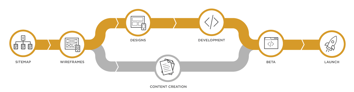
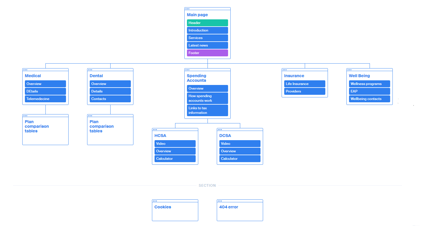
Sitemap
This involves creating a visual representation of how the content will be organized on each page of the microsite. What you’re trying to do is make sure all the content outlined in the planning step is organized intuitively so each employee, regardless of which stage of the employee lifecycle they’re in, can find the information they need with the minimum amount of clicks. E.g. During Open Enrollment is the comparison tables a few clicks away from the Homepage? Can New Hires find a useful checklist quickly?
These kinds of placement decisions can be subjective so get input from coworkers who are not as familiar with the project to ensure they make intuitive sense to someone coming to the site for the 1st time. Also, If there’s a companion printed brochure, it might be a good idea to use a similar information hierarchy. That way, once employees are introduced to the way things are organized in one piece, moving to the other isn’t as difficult.
It doesn’t hurt to take a stab at creating one on your own using useful tools like Octopus. Then we recommend getting a pro to help with navigation or other content concerns after you’ve made the first draft.
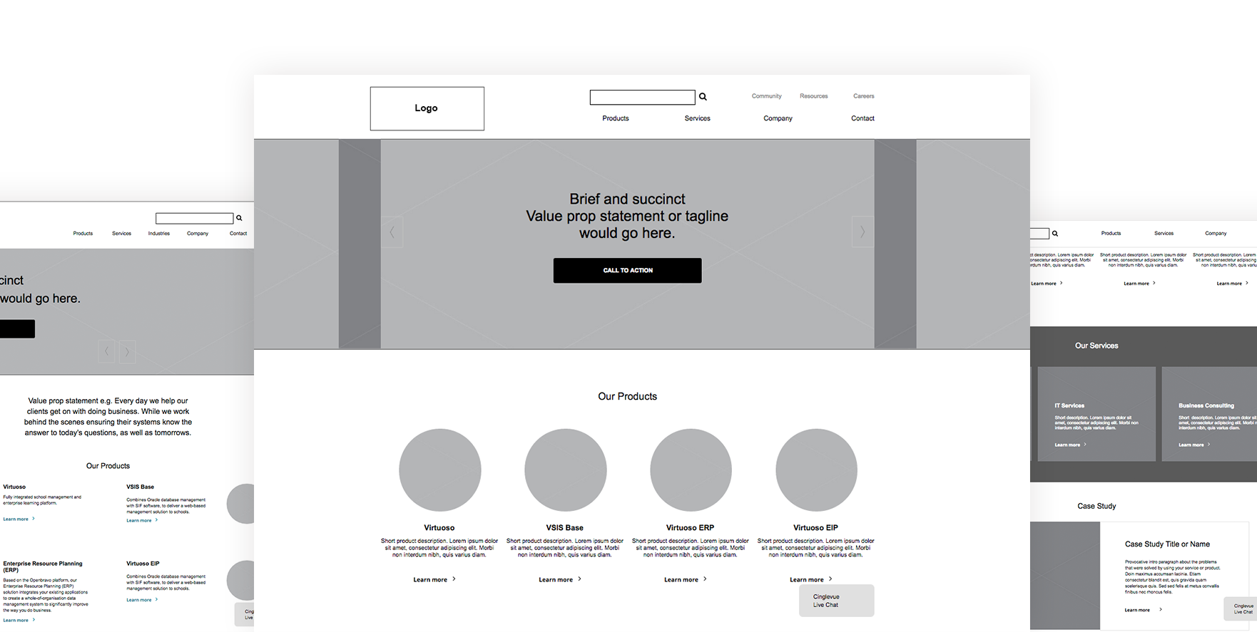
Wireframes
Wireframes are created to provide a low-fidelity representation of a proposed page design. They are typically used to communicate the structure and layout of a given page and to help stakeholders visualize how the content will look and function. These approximations, usually without color or images, help you work out where to put the content and functionality on each major page since moving grey boxes around is way easier than having to adjust finished UI elements.
We say ‘major page’ because there will be pages that share a similar layout even though the content is different (e.g. plan detail pages). So there’s no need to create a wireframe for each individual page, just a representative example of what those kinds of pages will look like.
This might take the form of a select few wireframes showing what a variety of the content modules would look like (e.g. comparison tables, accordions, multi-column text blocks, etc.). Doing it this way might be a bit more abstracted from what the final product will look like, but it ends up giving you more flexibility. This way of previewing wireframes provides with you a palette of options, like a kit of parts, that you can assemble to suit whatever content needs you might have. So if you have to create a new page on the fly, later on, you already have starter layouts ready to go rather than having to rely on the development team to build new pages from scratch.
While we recommend having a pro deal with this, you can help by providing reference diagrams if you can definite thoughts or requirements about the placement of certain content blocks. Aside from that, the kind of feedback most helpful at this stage would be:
- Are there any special content or functionality requirements not included in the layouts? Make sure you account for all the ways you think you’ll want to display content on the site. For example, how will multi-column text blocks be organized? How will a text block next to an image be arranged?
- Are the relative sizes correct? – Even though the size of a content block will be determined by the final content, you can still decide how much screen real estate you think they’ll need at this stage. E.g. will a list of plan options need icons with each link or photo? How tall do you want the top banner area to be?
- How will specific types of information, like newsletters or events, be delivered? Should there be a thumbnail along with descriptive text and a button or text links?
Design
This involves applying your client’s brand style guides to the wireframes. So the layout of the content will look familiar, just now they’ll have the appropriate colors, font choices, and imagery applied.
This is also a good time to start thinking about how you’re going to make this microsite accessible to all employees. It’s good for the overall employee experience, besides it’s the law.
Most accessibility features like alt text, input labels, etc are implemented during the development phase, but there are some you can keep an eye out for during the design phase. For example, text size, button size, and bad color contrast between text and their backgrounds. Check out our blog post on the four most common accessibility mistakes we see on HR microsites. Once this stage is complete the development team can begin building the designs in HTML on whichever Content Management system you’re using for the microsite.
Content Production
While the design and development are happening, the production of all the text, videos, infographics, and tables that will populate the microsite can begin.
When you’re writing about a topic this information-dense, it’s easy to get carried away and use a lot of jargon. But it’s important to write in a way that employees can understand, so avoid using industry jargon unless you can define it for your readers. Use short paragraphs and bullet points to make your points easier to scan, and a joyful, casual tone to help make the reading experience a pleasure. Useful tools like quillbot or the Hemingway app can help with making the text more readable.
Beta
Where content meets design, it is impossible to mockup every page during the design stage, as they can have so many pages, page branches, etc. So this is the point when all the style decisions finally meet the content and you can see how it all works together. Because of this, you might have last-minute tweaks to how designed styles are used to display the content, but this stage should really be about checking typos and making sure all the content is ready to launch.
Launch
Once your team’s satisfied that all content is accounted for in the beta site, it’s time to launch and pop the champagne. But your work’s not over yet. If you want the microsite to be a year-round resource for employees then you need to monitor how they’re using it, keeping an eye out for ways to improve the user experience. This is where analytics comes in, and if you’ve made it this far, then you’ll love our blog post about the key metrics you should pay attention to on an HR microsite.


