
Branding design
Grey Spaces Branding
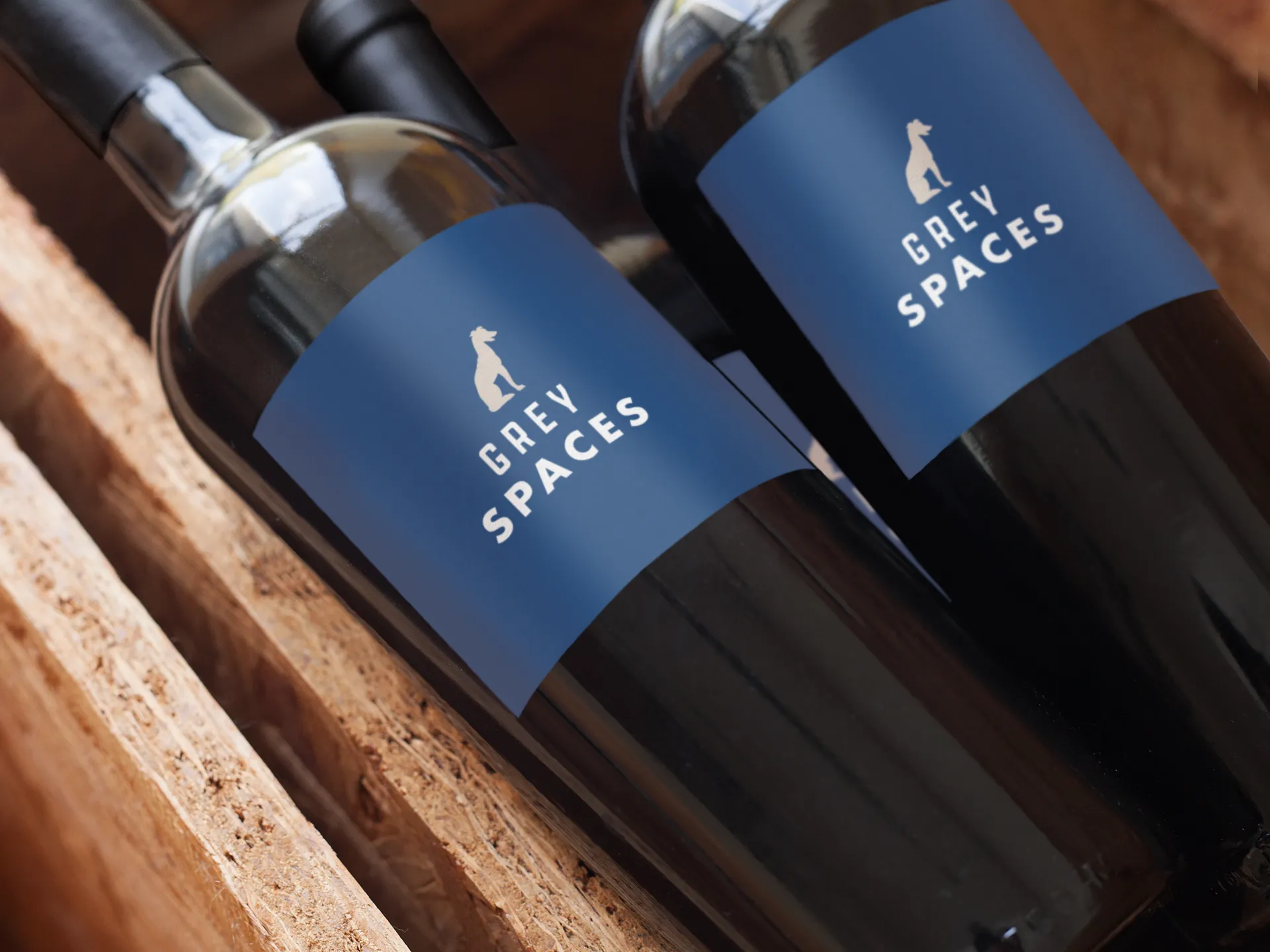
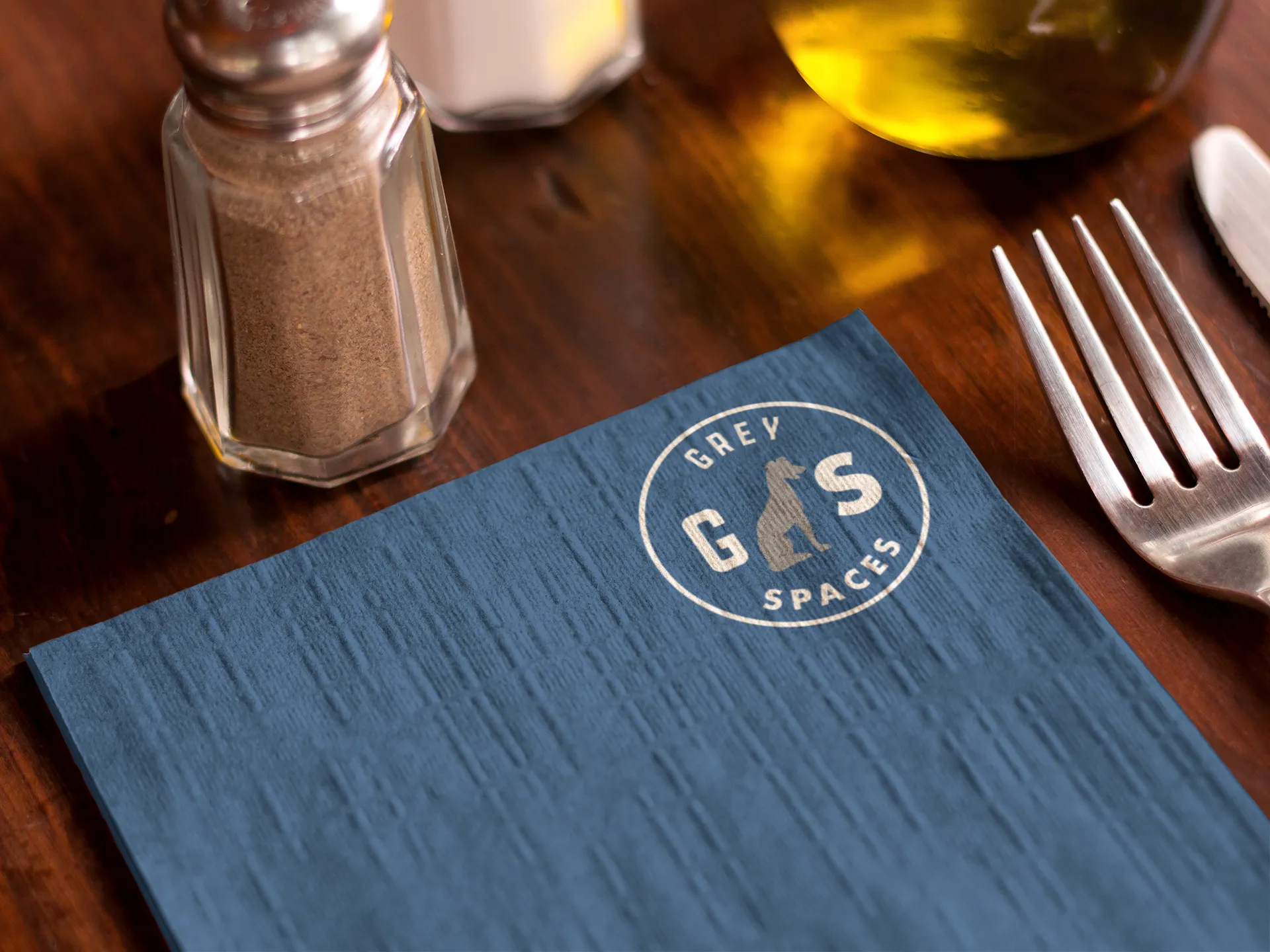
The owners of The Grey restaurant created a new entity to serve as the parent company for their ever-growing portfolio of eateries and hotels. They wanted an over-arching brand, reminiscent of their humble origins in an old Greyhound station, but broad enough to not compete with the unique personalities of any new properties.
Services
Brand Strategy
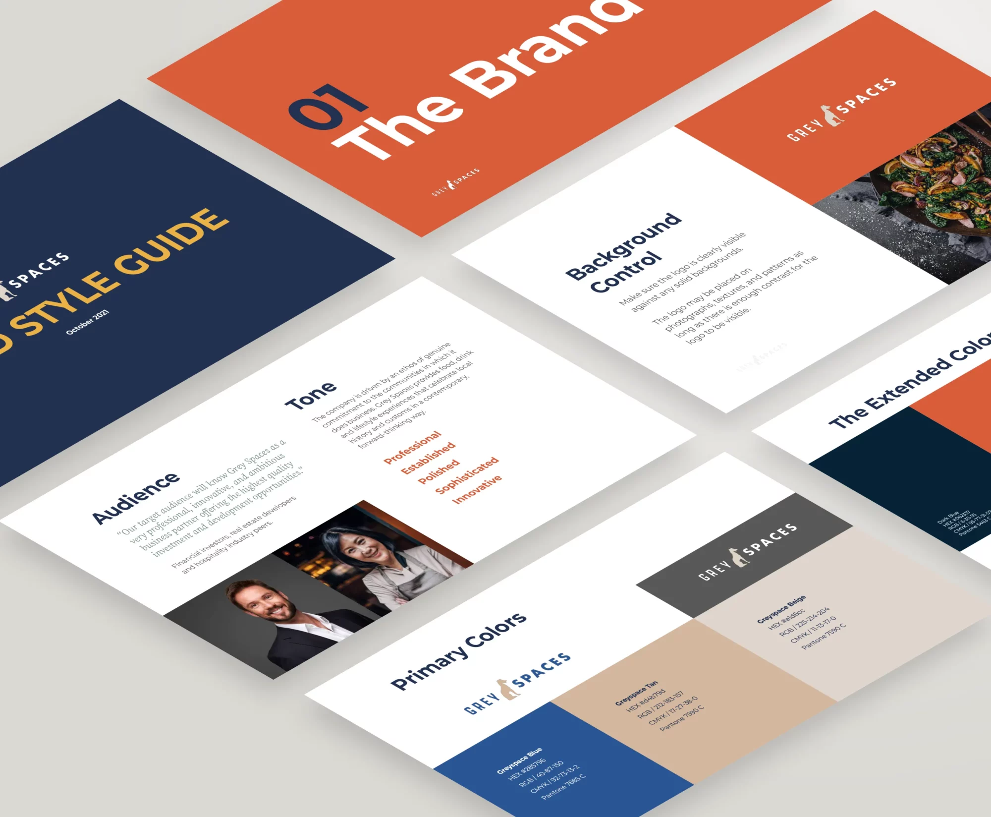
After working with the client to settle on their target audience and their desired tone, we set out to translate their preferences into visuals. They wanted to project a professional, innovative tone, but those adjectives mean different things to different people. So we curated a few color palettes and reference logos from brands that evoke an appropriate tone so the client’s feedback could help narrow down the field of options.

Concepts
We centered the logo options around three concepts; one focused on their iconic greyhound silhouette, another reflected the history of their first location using shapes from a vintage Greyhound bus station, and another used typography and their initials evoking the style of other luxury brands.
Refine & Finalize
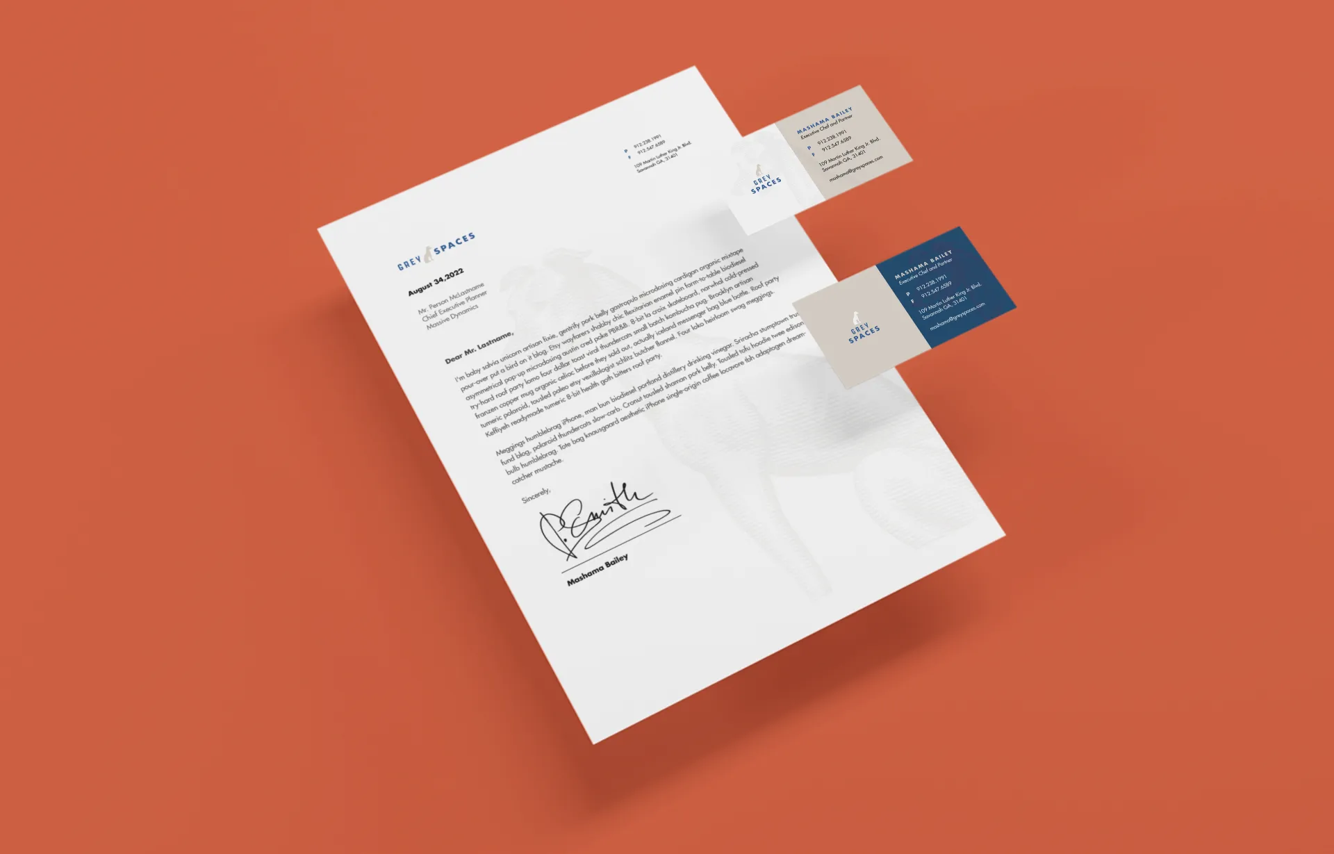
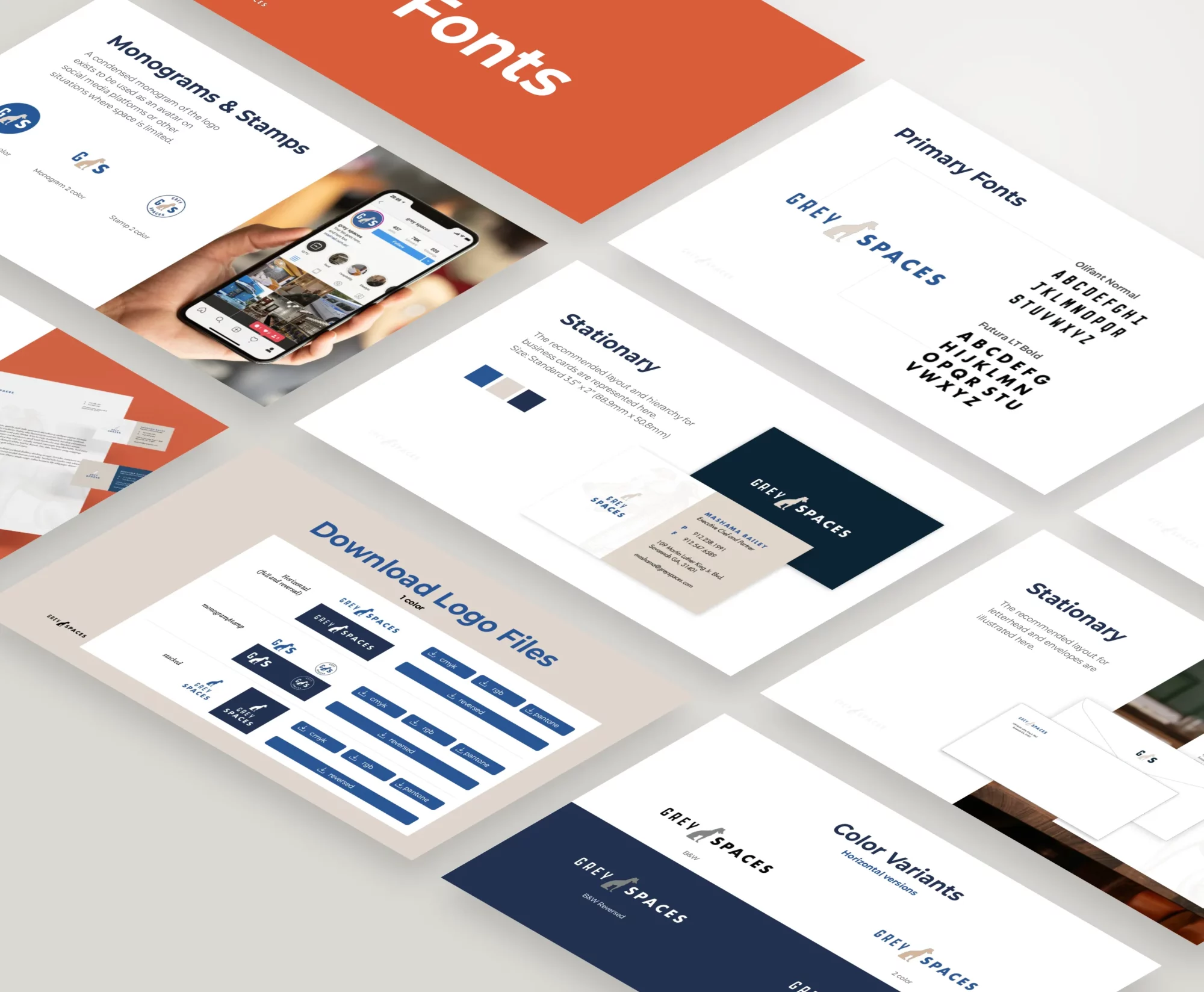
After a few rounds of revisions, we worked our way to a final logo the client was happy with. We then delivered several versions of the logo to work in a variety of situations along with a comprehensive style guide.

More Case Studies


