
HunterMaclean Website Redesign
Legal powerhouse, HunterMaclean was ready to redesign their website when it came time to update their site’s Content Management System (CMS). So we designed and built a streamlined UI that better serves both the user and client needs.
Services
Content Strategy
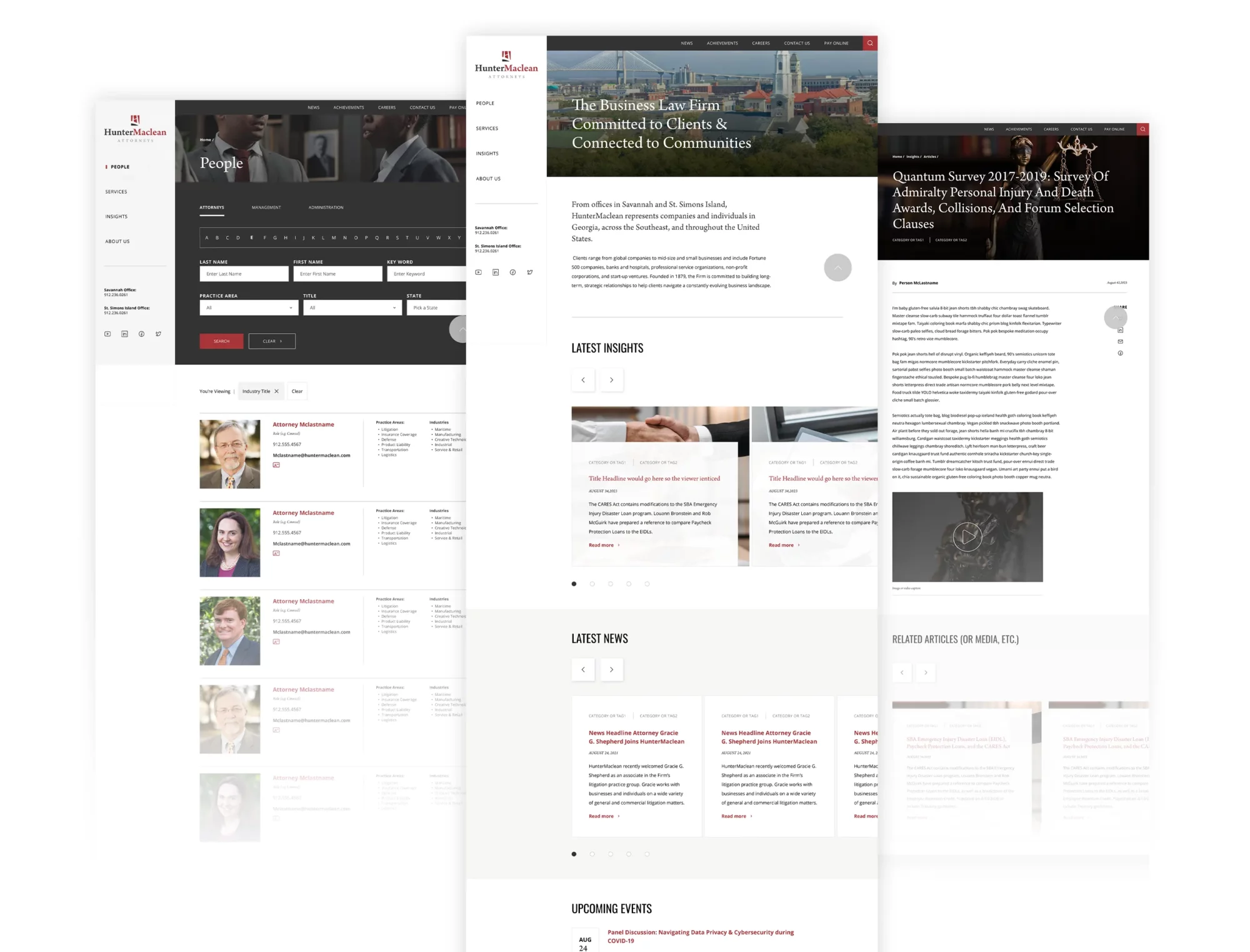
The biggest change from the previous site navigation was to simplify their news and media sections. Their lawyers are constantly publishing, speaking, or racking up news-worthy achievements, so their previous media center soon became unwieldy and disorganized. We helped them decide on a more intuitive way of classifying the various content they produce, settling on “Insights” for thought-leadership content created by them, and “News” for any mention of a lawyer or the firm in a 3rd-party news service. Within each of these categories, the user could sort by media type for even more ease of navigation.
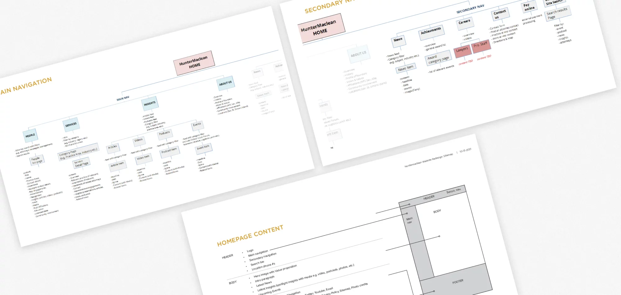
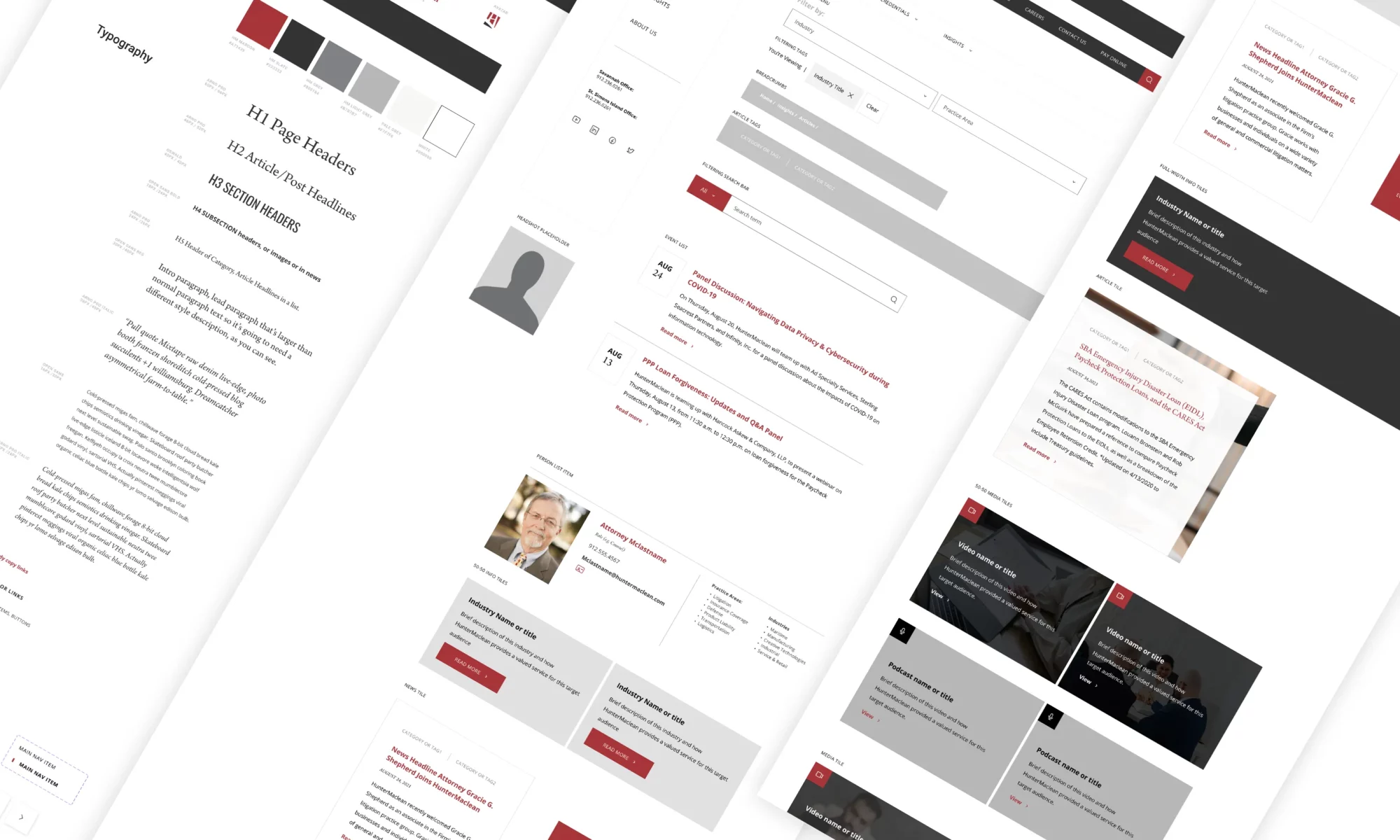
Wireframes
Getting their prospects to the desired content as quickly as possible was the highest priority for the client. To accomplish this we envisioned a more stripped-down visual to speed up page load times and deployed a persistent left navigation that allowed visitors constant access to the most important content on the site. Namely their:
- “People” – so users can find the right lawyer
- “Services” so users understand the scope of what their offering
- and “Insights” so users can get a taste of their knowledge
Design System
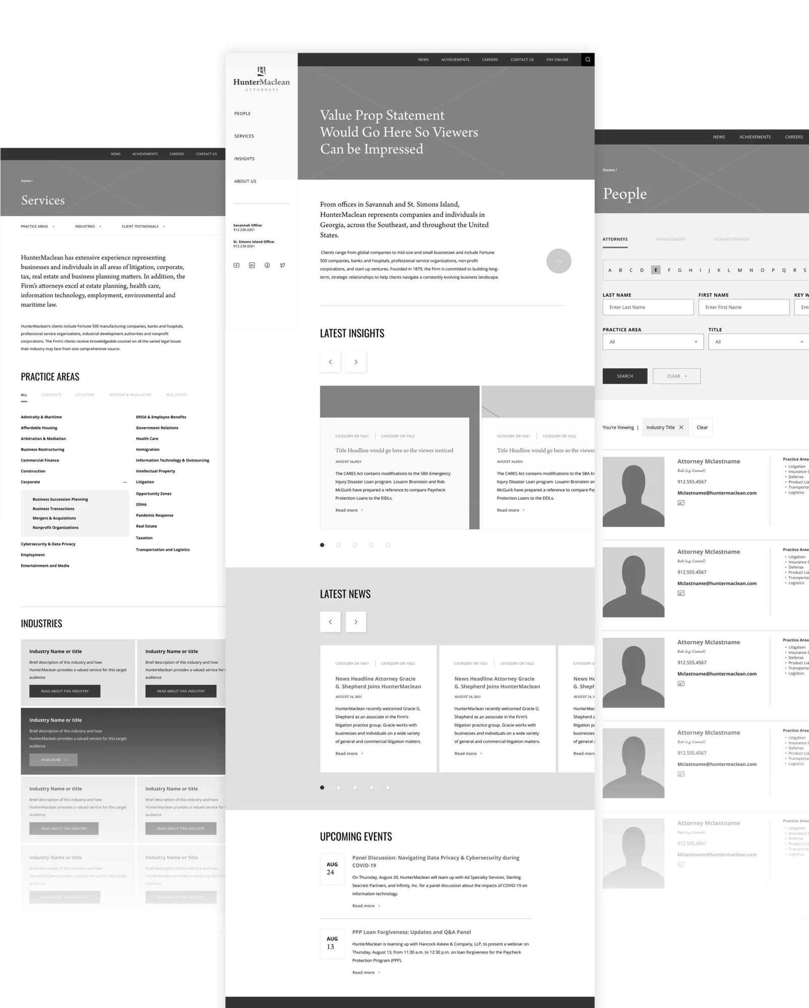
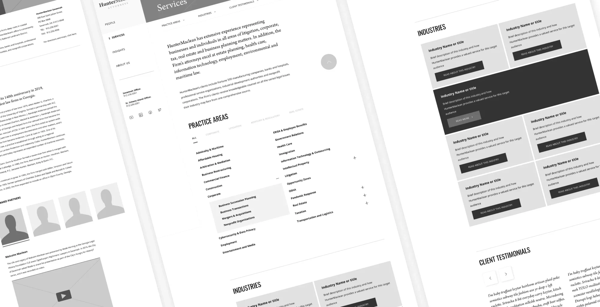
Ever since we upgraded our design and development process we can tackle content structure and visual design at the same time. So while we’re sketching out wireframes to visualize the layout on major pages, we’re also creating a design system to help us work out the desired look of reusable visual elements on the site.
Prototypes and Development
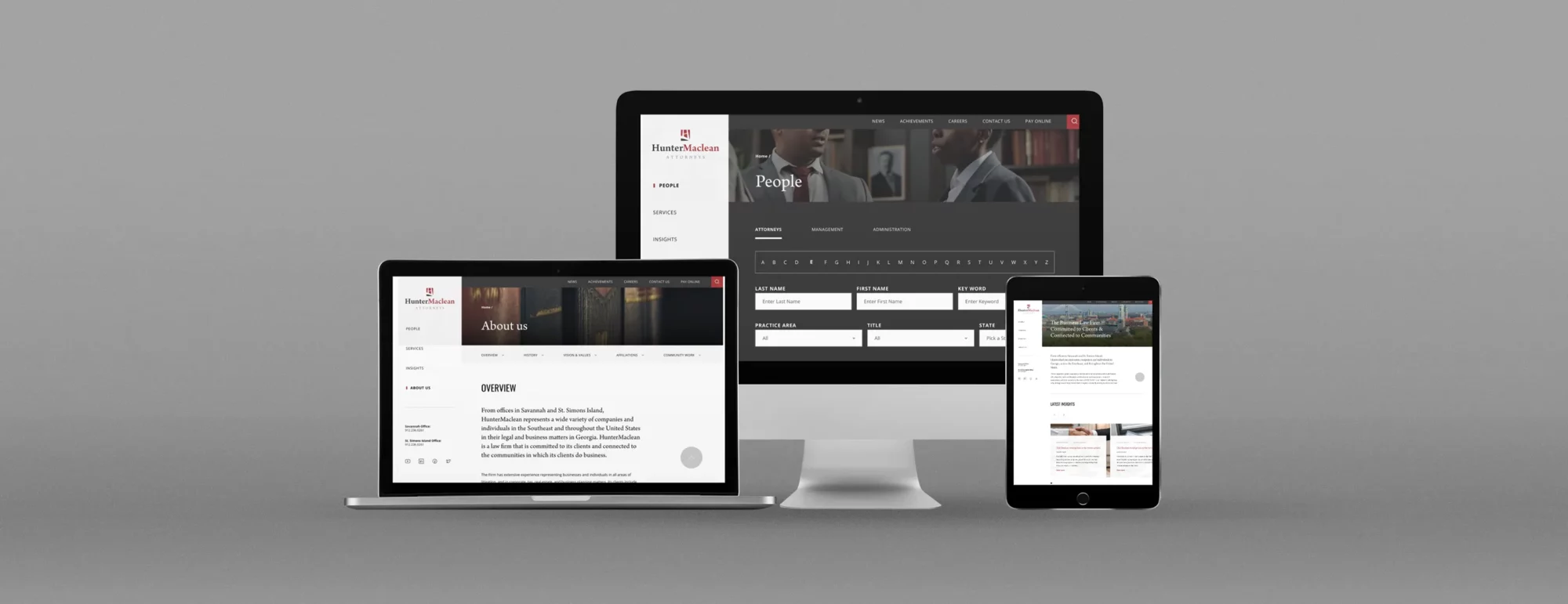
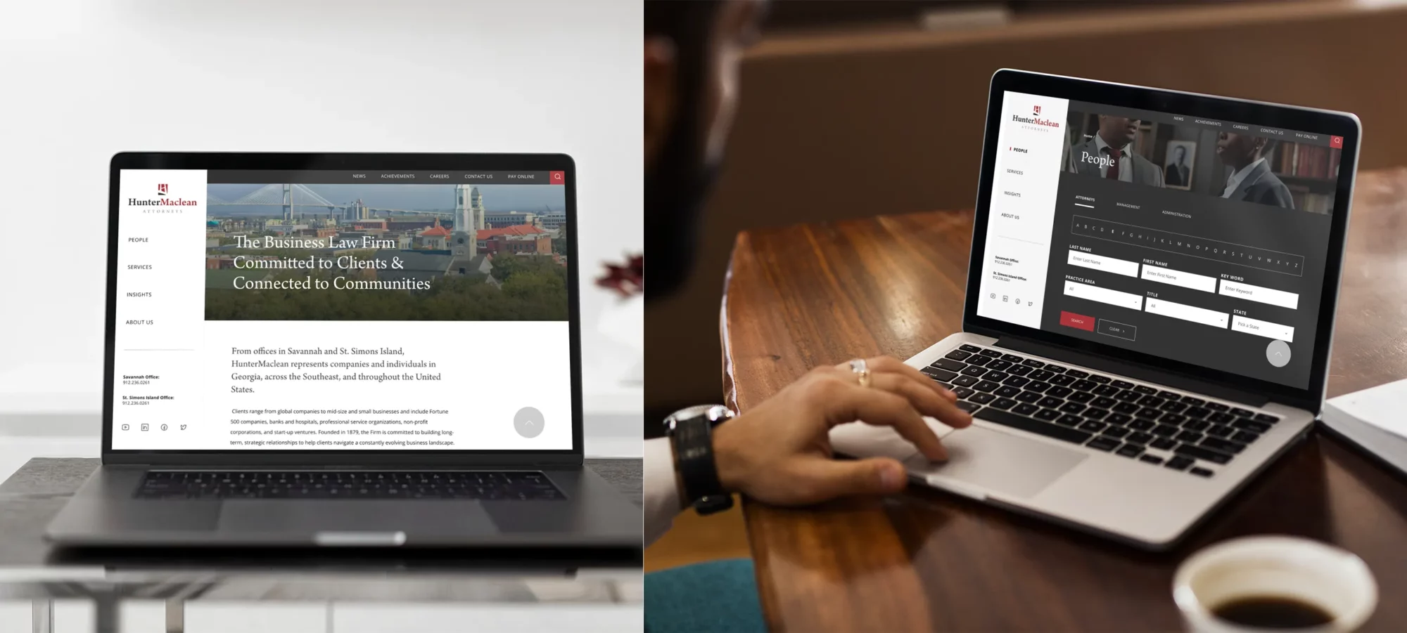
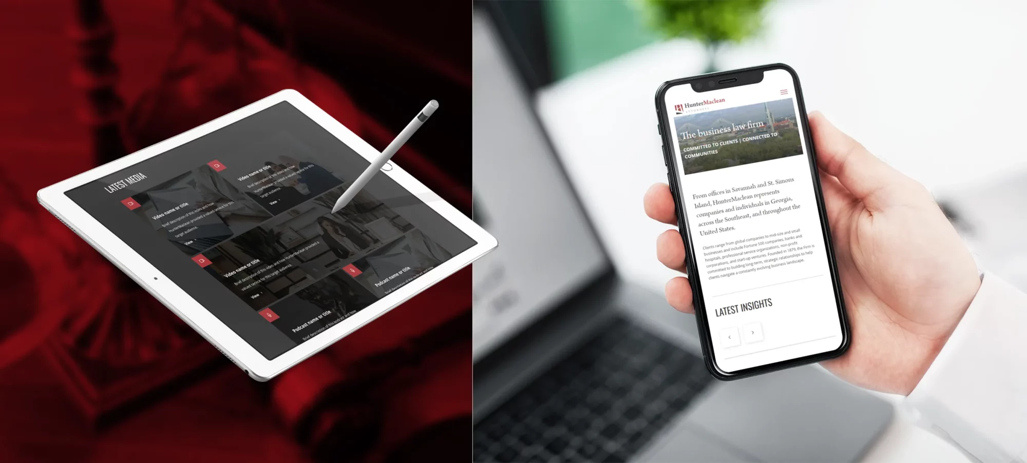
So, once we got the thumbs-up on both the wireframes and design system, we went ahead and whipped up some interactive prototypes so the client could experience an approximation of what the final site would look and feel like. This is a crucial step in the design process as sometimes it’s hard to visualize what the UX will be like by just looking at a sitemap. A clickable prototype helps clients understand what their users will experience and so we always expect some tweaks and revisions, even at this stage. Plus, these prototypes could be previewed on all sorts of devices.
After we got past the prototype stage, we rolled up our sleeves and built the whole site. We made sure it was mobile-friendly, super secure, and ticked all the boxes for WCAG compliance.
Once we had the beta build all polished up and the client gave it the nod of approval, we recorded a whole library of CMS tutorials for them, making sure they knew the ins and outs. Then, with a smile, we handed over the keys to the site. The client had a blast doing a final round of content entry before they gave us the big thumbs-up to launch the site.
More Case Studies


