
Economic Development Marketing
Port Tampa Bay Rebrand
Update Port Tampa Bay’s visual identity to represent their new strategy for communicating its entire scope of services from cruise ships to global container shipping.

The Challenge
Revamping a brand that already has a long history of familiarity is always a tricky proposition. This was amped up by the need to get buy-in from a large group of diverse stakeholders, each with seemingly conflicting preferences.
We needed to provide strong concepts that would appeal to all stakeholders while being sensitive to the legacy of the beloved logo. The existing brand, as familiar as it was, seemed to only reflect the industrial aesthetic of their container terminal. With a burgeoning cruise industry, they changed their name from the Tampa Port Authority to Port Tampa Bay and wanted a logo that could signify this move towards a more consumer-facing audience.
The Solution
Research
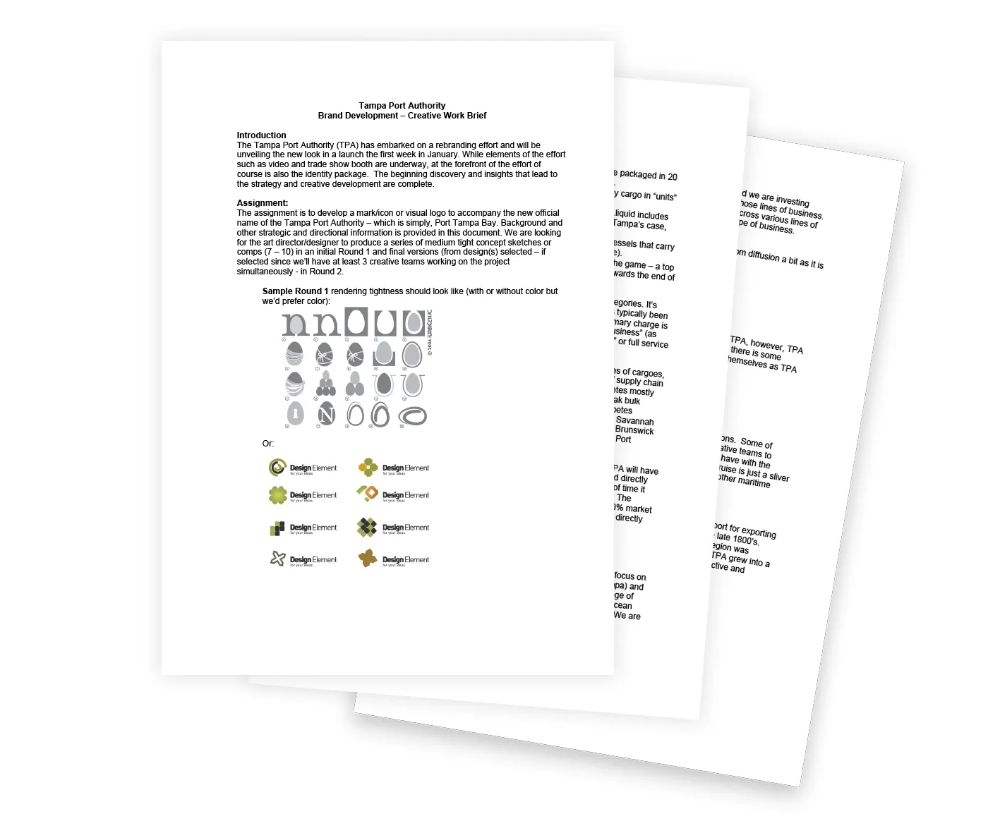
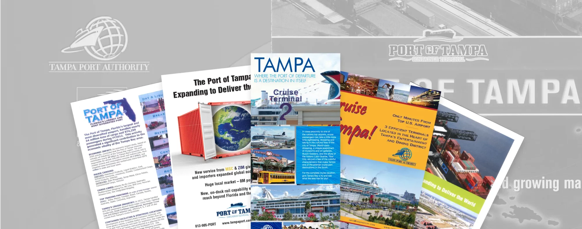
We started the branding process with a deep dive into the history behind the Port, their business model, and future plans for growth. Rebranding efforts are typically caused by a change in direction, so we wanted to learn more about what this new shift meant for the organization. It turned out that there were two Port logos in circulation and very little consistency about when to use them.
Concepts
As with any good branding project, we started by identifying relevant themes that could serve as the conceptual focal point for any designs we came up with. We worked with Port Tampa Bay to narrow these themes down to “Cargo”, “Global Gateway” and “Tampa as a place.”
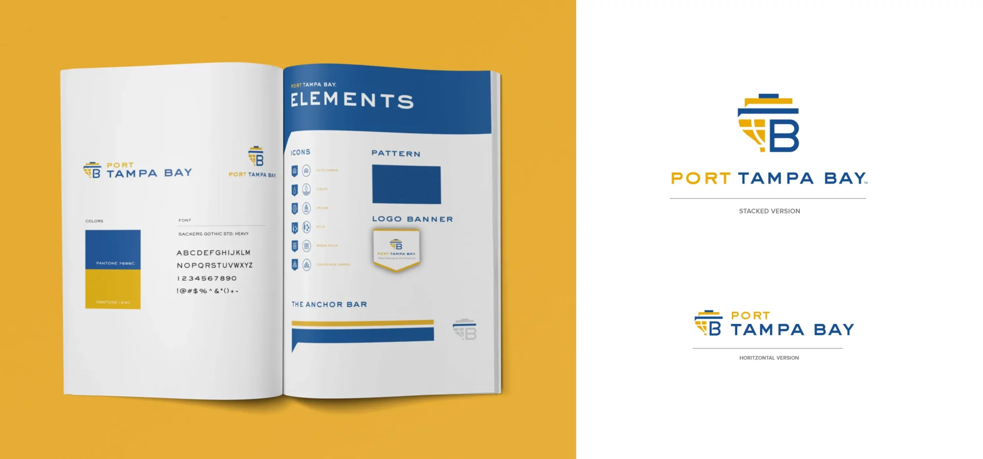
Refinement
With a final icon selected, we tested many different color variations with a sensitivity towards how the mark would be used in multiple touch points settling on a friendly, nautical color scheme.
Implementation
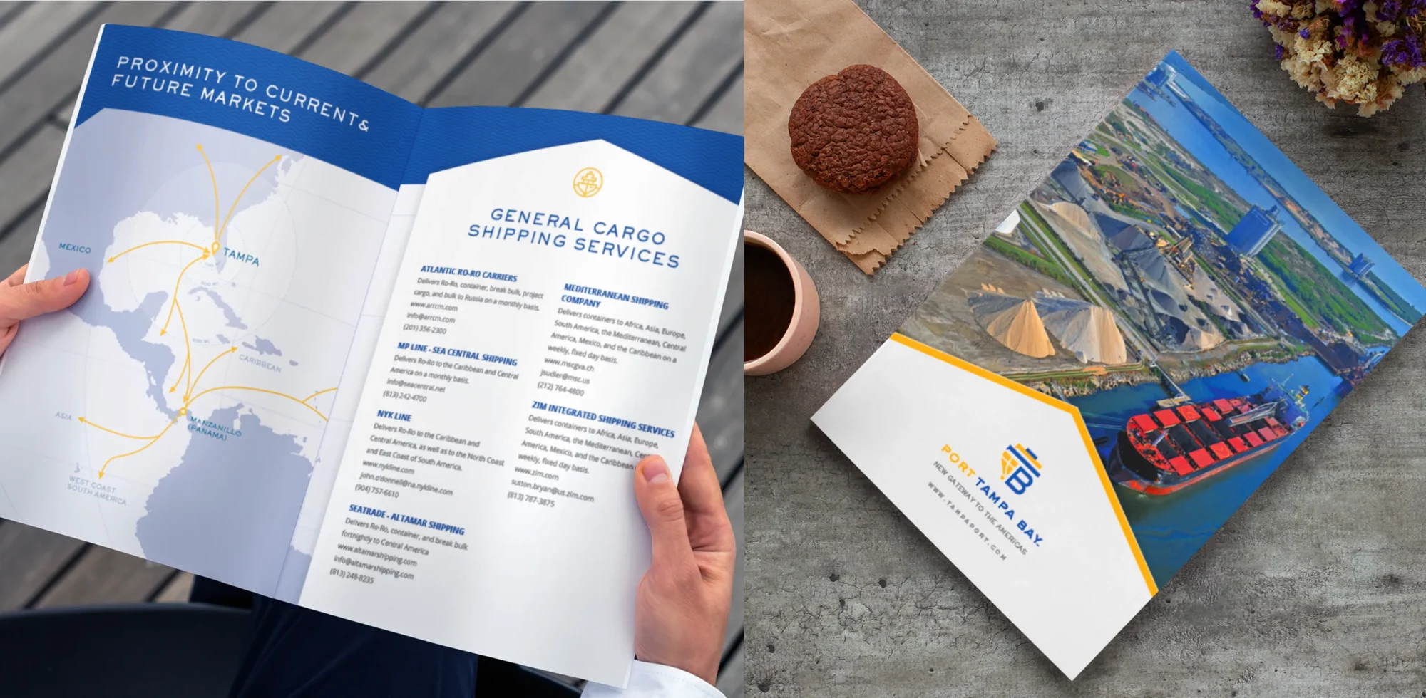
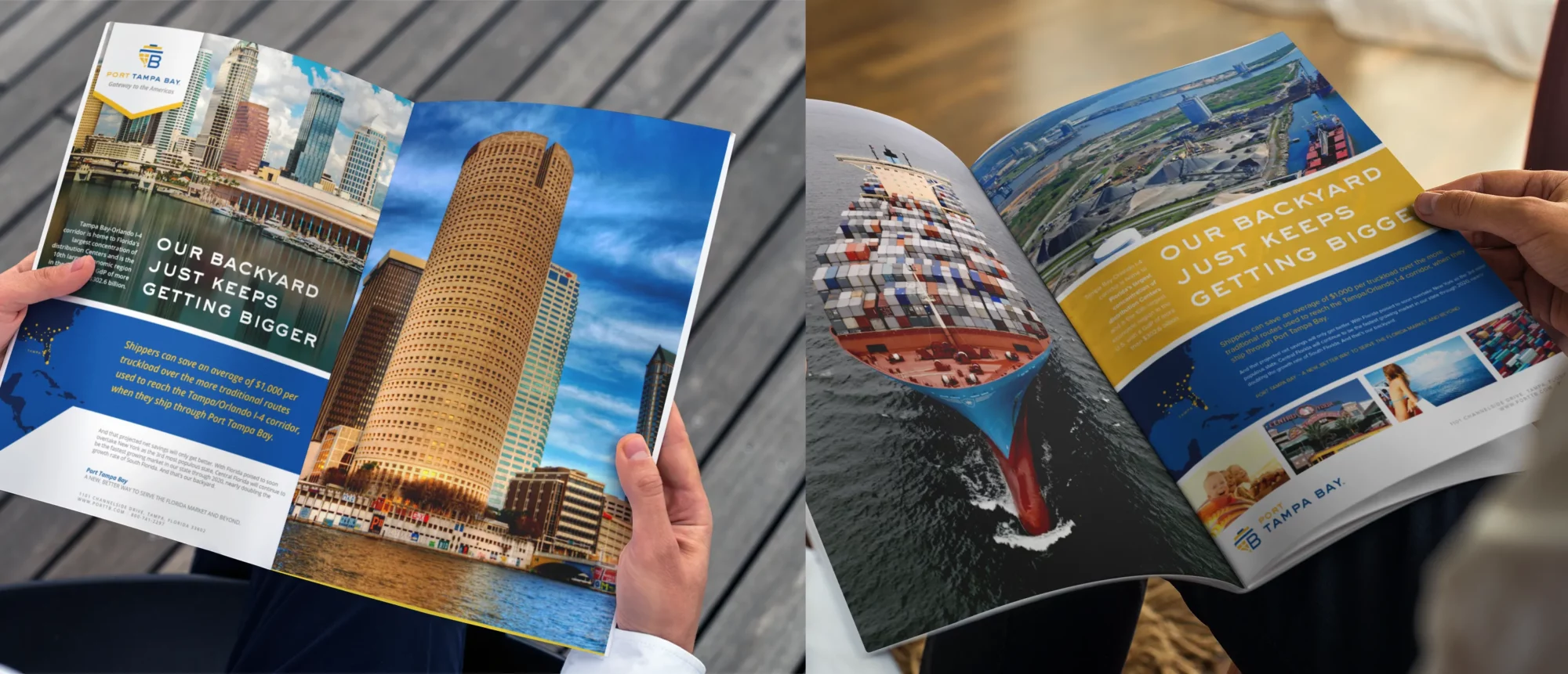
A visual identity doesn’t live in a vacuum, so once the logo and other brand elements were done, we got down to creating prototype designs for a whole host of promotional materials for the Port to use. This is the crucial final step of developing a flexible brand identity. This way we know that when we hand over the keys to their talented internal team for implementation they’ll have everything they need to create materials that are consistent, on-brand and visually stunning.


More Case Studies


